Gurmehub Campaigns Review Now!
POS Integrator PRO Now On Sale! Buy Now
TravelerWP Integration Now at POS Integrator Try Now

Single-page checkout is one of the most exciting features of Shopify's 100+ product updates announced during Editions Winter 2023. There's an old thread in the Shopify Community forum from 2019. There were more than 200 replies in the thread, but until recently, there wasn't a viable solution for single-page checkout.
As one of the most successful e-commerce platforms, Shopify offers a variety of options when it comes to the design and functionality of the pages where customers complete their checkout. Among these options, single-page checkout and three-page checkout are very popular. In this article, we'll look at one-page checkout, a feature that Shopify announced at its winter event last year.
They usually contain little space and are organized as simply as possible. The basic assumption is that fewer steps and less abandonment means more conversions. One-page checkout allows customers to collect all the necessary information on a single page. This method speeds up the checkout process and improves the customer experience. Compared to a three-page checkout, a one-page checkout collects the same information and gives administrators access to analytics associated with the checkout. Furthermore, both methods support the same customization options and ensure that previous customizations work seamlessly.
Which type of checkout is better is a matter of debate, but many stores argue that one-page is better for practicality and customer satisfaction. A standard multi-page checkout consists of 4 basic pages:
Information- Step to enter relevant customer details such as customer name, email address, etc.
Cargo- The necessary step to choose one of the shipping methods.
Payment- Step involving choosing one of the payment methods.
Order Confirmation- The step containing the order confirmation, which I can also call the thank you page.
With quick checkout, once clicked, the customer only needs to log in to their existing account and basically skip the entire checkout process. This provides a good mix between single-page and multi-page checkout. How well the checkout is optimized is important. Many single-page checkouts on different e-commerce platforms are just crammed with information and fields.
There are some important points to consider when switching to single-page checkout. For example, it may affect the way the background image of the single page checkout page is displayed. In this case, it is necessary to edit the way the background image is cropped, and it is also necessary to check the theme content editor, where new customizable expressions can be found.
For Shopify store owners who want to change the checkout page layout, there may be differences in the steps to follow. For Shopify Plus, it's possible to switch directly within the checkout settings, while stores that don't use the Plus plan can make changes from within the theme.
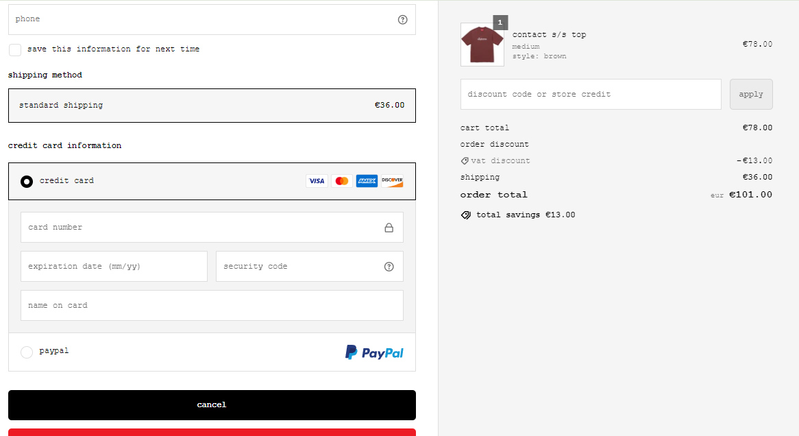
There are very few single-page pay live Spotify pages available. Supreme is one of them. It's designed to fit the site, but it's clearly visible that it uses single-page checkout.
